Bowmore
From Islay's edge to global position
When Suntory merged with Jim Beam Brands their folio contained both Laphroaig and Bowmore. There was a need to distinguish between these Islay malts to avoid cannibalisation from either’s consumer base. Bowmore is less heavily peated than most other Islay malts and continually lost out on that front. We were tasked with creating a new position for the brand, and evolving the visual identity to attract a new audience without alienating the existing one. Our change in positioning - from Islay 'minus' to Glens 'plus' - enabled Bowmore to become a credible, go-to regular in the premium single malt drinker’s repertoire.
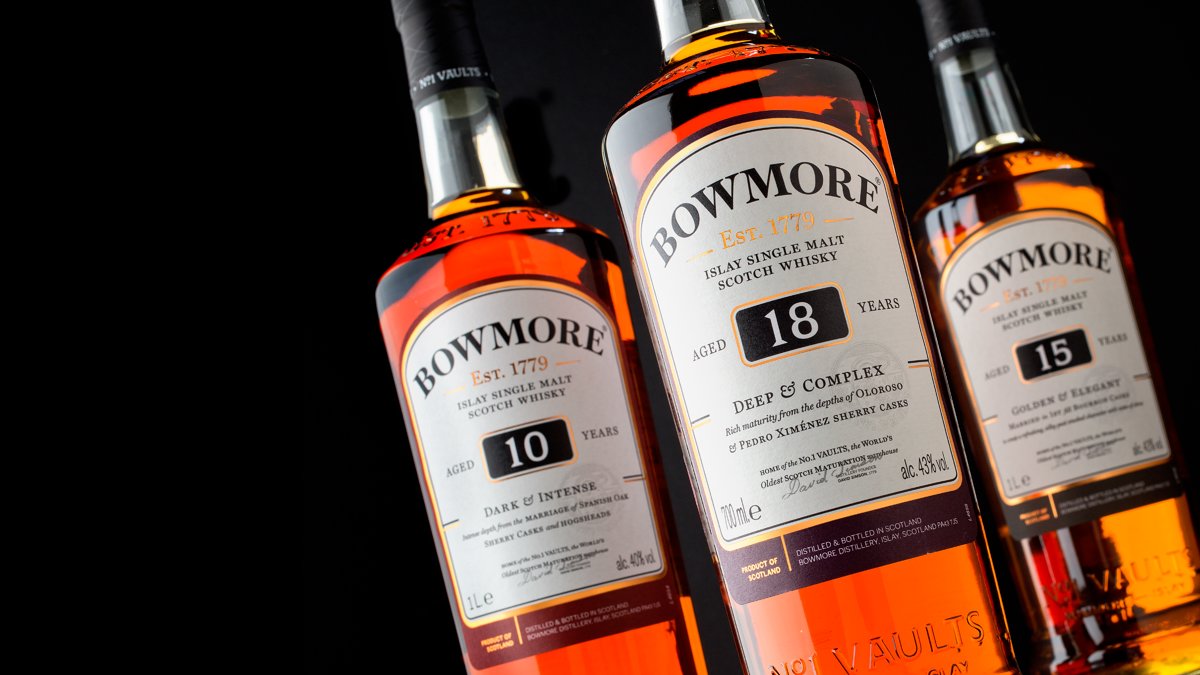
Our redesign told more of the story of the No.1 Vaults - the world's oldest Scotch maturation warehouse - on pack, increasing quality cues and sales as a result. The bottle embossing was customised, bringing more storytelling onto the shoulder area and lower section whilst allowing for a new, larger label for shelf standout.


